Packaging
From Shelf to Sip: Exploring the Impact of Wine Label Design
By Suzanne Besson

During a recent visit to my local Majestic wine store, I found myself unexpectedly captivated by a bottle of white wine nestled deep within the shelves. What drew me to it wasn’t the region or the grape, but rather the design of its front label. Despite it having a lack of back label information, I was still intrigued, and it took the guidance of a knowledgeable shop assistant, who had featured the wine on the tasting table the previous week, to convince me of its merit. Having worked in packaging for over 26 years, it’s not unusual for me to be influenced to make a purchase by a beautiful piece of packaging, but this got me thinking about how important wine label design really is.
In the early 1900’s, Baron Philippe de Rothschild commissioned the first wine label designed by an artist, igniting a trend that reverberates across the industry to this day. Winemakers worldwide soon recognized the power of eye-catching artwork in setting their products apart in a crowded market.
While an attention-grabbing label is crucial in initiating the purchase decision, it must also convey essential information to the consumer. A balance between aesthetics and informativeness is paramount. In countries with a rich wine culture, such as France or Italy, factors like grape variety, style, and provenance often dominate consumer preferences. However, in markets like the UK, where diversity reigns and consumer knowledge varies, the label plays a more pivotal role in influencing purchasing decisions, alongside price and personal taste preferences.
Through strategic design elements like colour, typography, and imagery, labels differentiate brands, captivate attention, and are able to evoke positive emotions. Effective designs convey compelling stories, connecting consumers with the brand’s heritage, personality, and winemaking process. By fostering engagement and attracting attention, labels not only stand out on shelf but also build brand recognition and loyalty. In essence, investing in thoughtful label design is essential for brands to thrive in the market.
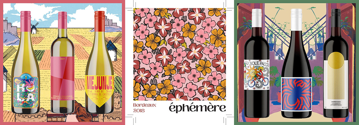
Additionally, innovative approaches to wine label design are reshaping the industry landscape. For instance, companies like Wine52, led by Fraser Doherty, Co-Founder & CEO of Beer52.com & Wine52.com, are revolutionizing the wine subscription model. Doherty explains, ‘At Wine52, we love uncovering interesting wines from lesser-explored regions such as Moldova, Georgia, and Romania as well as from small family-owned wineries in Italy, Spain, and Portugal for example. By working with local artists to design unique labels for each of the wines, we are able to incorporate local culture, history, and design traditions. Our customers really value this approach, and we share the stories of each of our collaborating artists in our magazine, Glug.‘ By sourcing wine from small producers and collaborating with local artists from the producing countries, Wine52 creates a unique and consistent theme for their range. They redesign labels to suit the UK consumer while championing the stories and locations of the wine producers. This innovative approach not only enhances the visual appeal of their products but also fosters a deeper connection between consumers and the wines they enjoy, further highlighting the importance of thoughtful label design in the modern wine market.
 Image Source: Equator Design
Former buyer and renowned Drinks Consultant Ivan Dixon has witnessed a revolution in wine branding over the last decade. Traditional designs have given way to more innovative and visually striking labels. Retailers now demand extravagance, loudness, and colourfulness to appeal to a broader demographic. The integration of brand stories and captivating imagery adds depth and intrigue to the label, enticing consumers to explore further.
Dixon emphasizes the importance of minimalist yet compelling designs that draw consumers to pick up the bottle and engage with the label. Modern labels offer insights into the winemaker’s attitude, signalling a departure from generic offerings. Premium materials and tactile finishes further enhance the perceived value of the product.
However, a minimalist front label necessitates clarity in the information provided on the back or through connected packaging options. Without the backing of prestigious appellations like Chablis or Côtes du Rhône, brands must exert additional effort to distinguish themselves in the market.
In the dynamic landscape of the wine industry, the role of label design transcends mere aesthetics. It serves as a powerful tool in captivating consumers, communicating brand identity, and differentiating products in a competitive market. As trends continue to evolve, winemakers must embrace innovation while maintaining a delicate balance between form and function in their label designs.

Image Source: Equator Design